
ABB: data visualisation dashboard app
Project
A monitor to be able to check daily social media activity from target audience
Problem
The client's social media platforms have not been thriving well and wishes to have something to monitor their promoted activities.
Solution
To create a tailor-made dashboard app showing daily social media activity.
Roles
UX design
UI design
Interaction design
Data visualisation
ABB commits to driving industrial-standard transitions with their latest technology. Over the past decade there is less social media activity to showcase what their company can offer. They now wish for a means to check how their social media channels perform.
The client was undecided between the use on existing third-party monitoring tools or a bespoke data visualisation app that is tailor-made with their brand in mind.
My role was to come up with dashboard interface designs that would be suitable to the client's needs, offering clear data visualisation to the user.

Visual designs of social media data at a glance

Visual designs of social media data in detail
User goal
The clients wishes for a means to monitor activity among popular social media channels daily.
Research, ideation & problem solving
After internal discussions within our own team, it is discovered that analytic reports on social media activities are generated at the end of each month. This means that deciding on what data to present for daily checks differs from monthly ones.
I had to ideate layout designs based on data provided from our own marketing team. I also have to ideate on which type of visualisation chart would be suitable depending on the nature of what data is provided from which specific social media platform.
Ideation stage of dashboard visuals with suitable data visualisation for each analytic data

Ideation stage of dashboard visuals with slightly different data visualisation for each analytic data
For the data visualisation types, feedback was gained internally and deciding that in the initial ideations, the data visualisation types were too different, so we had to reign back and decide for a clearer approach to the user.
From the data provided by our own marketing team, I've decided to find a common denominator on all analytic types from each social media channel and an interface that shows the daily 'meet-your-target' checks, based for that current month.
Designs
The desktop screen dashboard was reconstructed with the above progress in mind.
We had also decided to have two types of designs, one to see everything in one setting, the other was to expand or collapse the data view in detail based on the social media platform. The latter was decided based from the original ideation above where each social platform was to have its own tailor-made data.
Decisions to have the detailed data visualisation types in a cleaner, clearer design was put into place.

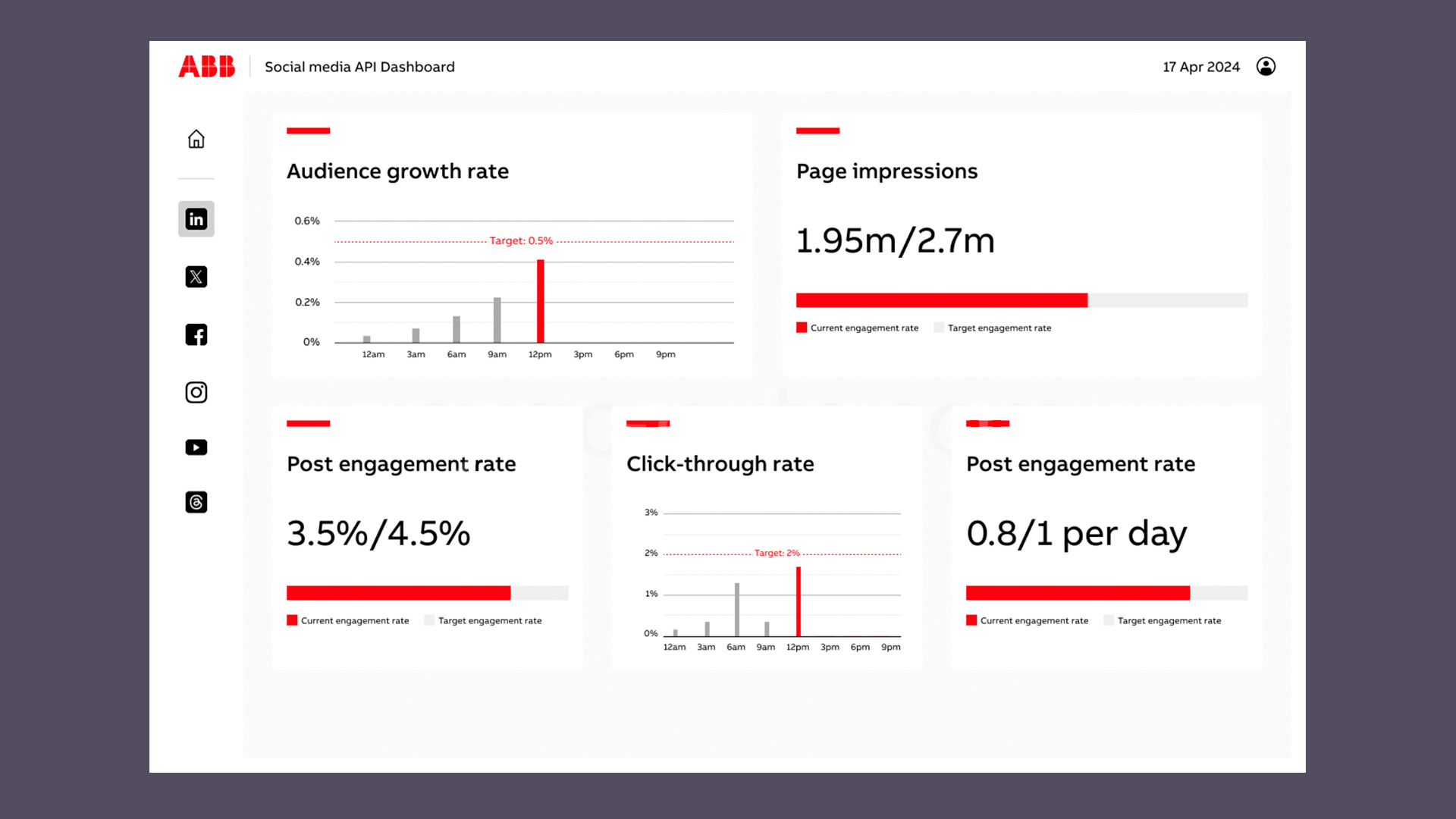
Final visual design of the dashboard with analytic data at a glance

Final visual design of the dashboard with detailed data for a specific channel
Reflections
While my main role was to create a bespoke monitoring dashboard, there was the other option to research on third-party apps that could already perform what the client had in mind. Due to tight deadlines, it was agreed that other colleagues had gone to research on other third-party apps to see if the other tool were more suitable for the client's needs.
I wish to have researched a bit more on the third-party apps as this will not only influence my designs more but it'll inspire my understanding of how monitoring apps would behave.
While the client had liked the bespoke design, they had decided to go with the other option due to budget constraints.

See another project…
The Cover: data visualisation widget (with real data)
Showcasing an online data visualisation with real data and the decision-making behind it.

